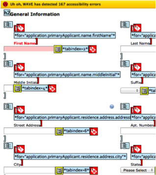
But what about:
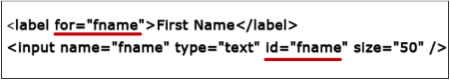
H44: Using label elements to associate text labels with form controls
<label for="fname">First Name *</label>
<input required type="text" name="fname" id="fname">
Do this for every single field! If you don’t want to see the label then hide it off screen with CSS.
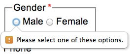
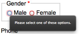
<fieldset>
  <legend>Gender *</legend>
  <input type="radio" name="gender" value="male" id="male">
  <label for="male">Male</label>
  <input type="radio" name="gender" value="female" id="female">
  <label for="female">Female</label>
</fieldset>
H71: Providing a description for groups of form controls using fieldset and legend elements
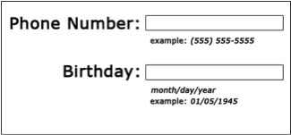
<label for="bday">Birthday * MM/DD/YYYY</label>
<input type="text" name="bday" id="bday">
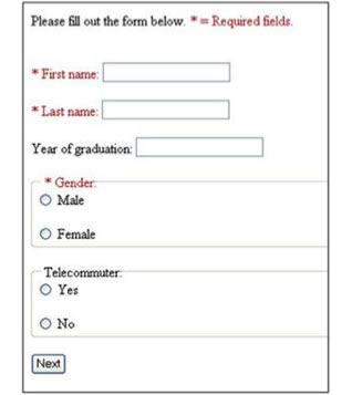
No one enjoys filling out forms! If you want to get useful data and not scare your users away then only require the least amount of fields as is necessary.
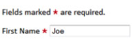
Indicate the field is required by placing a red * in the label or the text (required).
H90: Indicating required form controls using label or legend
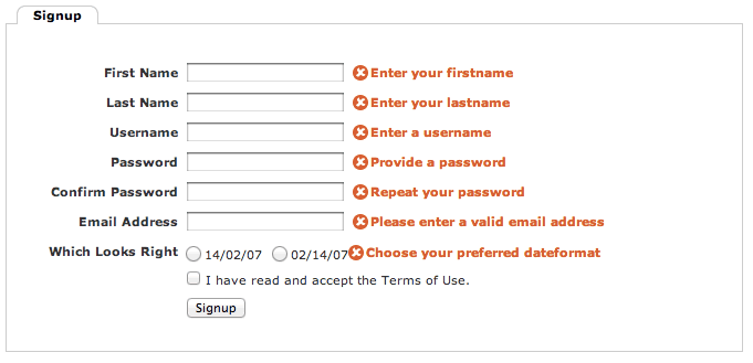
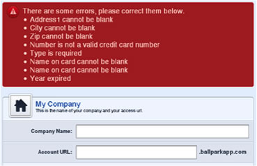
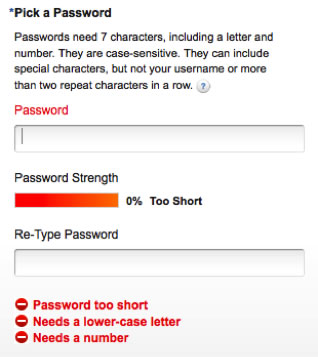
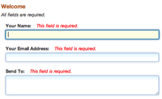
 Help users out by providing useful error messages and suggestions to correct them. Placing the error in a label will cause a screen reader to speak each error as the user tabs through the form fields.
One of the biggest failures with forms is not sending keyboard focus to the field with an error or the list of error messages. Assistive Technology users will have no idea there’s something wrong if the screen reader goes blank or their magnifier does not move focus to the error.
When nothing happens after pressing the submit button they will assume your form is broken.
Now that you’ve got the basics out of the way, adding HTML5 validation and usability enhancements is a piece of cake!
With the HTML5 required attribute and HTML5 input types you can put the responsibility of accessible form validation on the browser developer.
<label for="lname">Last Name *</label>
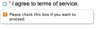
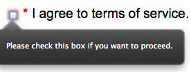
<input type="text" name="lname" id="lname" required> <input type="checkbox" name="tos" id="tos" required>
<label for="tos">* I agree to terms of service.</label>
| Browser | Text | Checkbox | Radio |
|---|---|---|---|
| Chrome | 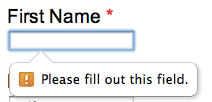 |
 |
 |
| Firefox | 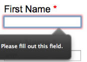 |
 |
 |
Of course the required attribute does not work on all browsers, Safari and Mobile Safari being the two where I miss support the most. You can read more about HTML5 browser support at The Current State of HTML5 Forms - The required Attribute by Chris Coyier (@chriscoyier) of CSS-Tricks fame. That resource is a bit out of date as support has improved in many browsers.
Control the visual presentation for a variety of states on your HTML5 inputs. BE CAREFUL WITH COLOR CONTRAST!
input:invalid
input:valid
input:required
input:out-of-range
input:in-range
HTML5 Form Validation with Style | Web Builder Zone
HTML5 Form Validation | Stephen Walther
<input required title="First Name is Required!" x-moz-errormessage="First Name is Required!" />
Do we really need the title attribute here? Not liking this because NVDA/FF reads both title and moz error msg but it is the least amount of code.
<input required oninvalid="this.setCustomValidity('HTML5 oninvalid event with setCustomValidity')" onchange="try{setCustomValidity('')}catch(e){}">
autofocus
required
multiple
formnovalidate
novalidate
Understanding HTML5 intelligent forms – Part 1: New input elements | Adobe Developer Connection
Understanding HTML5 intelligent forms – Part 2: New form attributes | Adobe Developer Connection
<input autocomplete="off"> <input spellcheck="false">
HTML5 input types greatly enhance the usability and accessibility of forms on mobile devices. In iOS, the iPhone, iPad, & iPod Touch platform, most input types will display a keyboard enhanced for that data format. It is very rare to see forms in the wild take advantage of these simple usability enhancements. By default input type=text displays the normal alphabetic keyboard. If you need to type numbers, the @ symbol in an email address, or the .com for a URL extra taps are required.
| Type | type=text | type=email | type=tel |
|---|---|---|---|
| HTML | <label for="text">Text:</label> <input type="text" name="text" id="text"> |
<label for="email">Email:</label> |
<label for="tel">Tel:</label> <input type="tel" name="tel" id="tel" /> |
| Output | |||
| Screenshot | 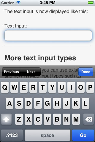 |
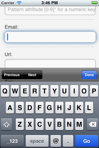 |
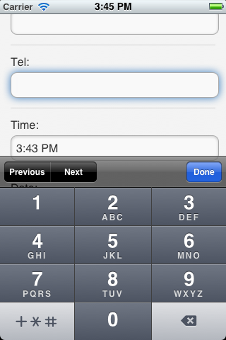 |
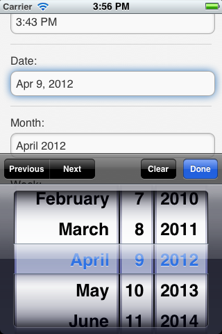
<label for="date">Date:</label>
<input type="date" name="date" id="date" />
Because these different keyboards and spinner controls are native to iOS they're accessible by default. Apple's done all the work for you.
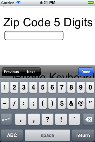
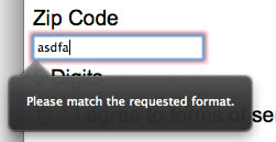
<label for="zip">Zip Code 5 Digits</label>
<input type="number" pattern="[0-9]*" maxlength="5" min="0" name="zip" id="zip">
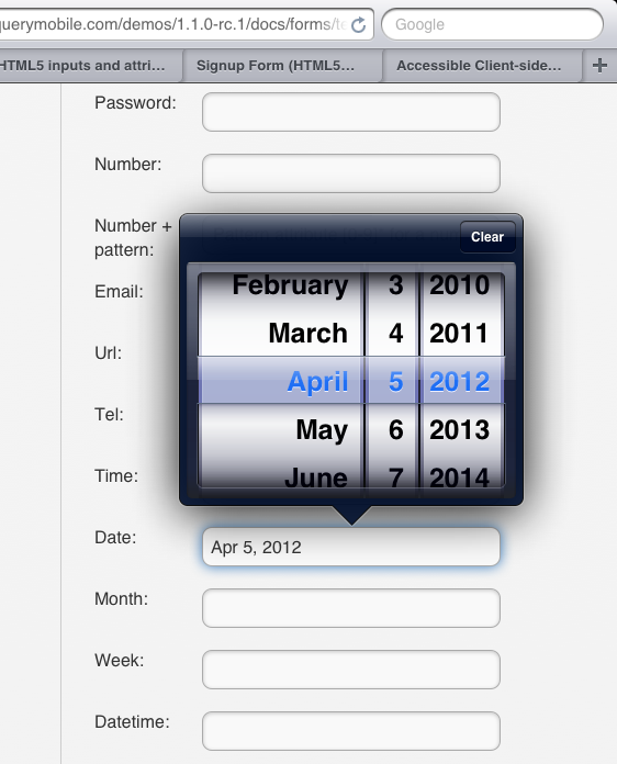
| input type=number | input type=number pattern="[0-9]*" |
|---|---|
 |
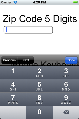 |

 Using the pattern attribute, pattern="[0-9]*", with the number input type will display the 10-digit numeric keypad similar to the tel keypad. This is much more usable than the standard number keyboard which shows a lot of keys that are not needed for simple numeric input like a Zip Code. We have fat fingers and mobile keyboards have tiny buttons. Anything you can do to increase the tap target size of a button really helps out!
HTML5Pattern.com has Regular Expression patterns that can be used to validate complex input types. These are live and can be tested in supported browsers.
You can visit HTML5 inputs and attribute support in a browser to test its support for HTML5 forms and click through all the input types. Another great page to test support for HTML5 form attributes is the jQuery Mobile - Text inputs Docs. I love the jQuery Mobile project as it does two things I'm passionate about, mobile & accessibility, very well!
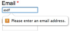
By adding an input type=email the browser will ask for more specific input formatting to make sure the user actually types an email address in the format name@domain.com.
If we add the required attribute to input type=number Firefox will ask for numeric data that matches the specified pattern attribute.
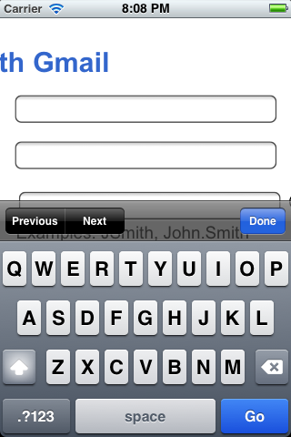
By placing the label directly above the input you improve the experience for mobile and screen magnification users. When focus is in the input the label will no longer be cut off like in the below example of the Gmail sign up form where the label is placed to the left but cut off when viewed on an iPhone.
Using CSS you can enclose formatting instructions in a span tag and position them directly under the input so they are still visible when zoomed in.
<p class="instructions-container">
  <label for="zip">Zip Code <span class="instructions">5 Digits</span></label>
  <input type="number" pattern="[0-9]*" maxlength="5" min="0" name="zip" id="zip">
</p>
.instructions {
	position:relative;
	top: 1.6em;
	display:block;
}
.instructions-container {
	margin-bottom:2em;
}
.instructions-container label {
	margin-bottom:-1.2em;
}
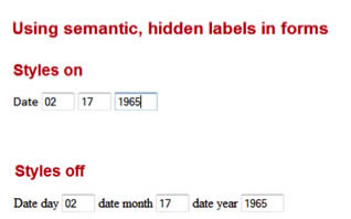
You may want to visually hide some labels where the input might be obvious to most sighted users. We can use CSS positioning to do this. The code for this comes from the WebAIM article, CSS in Action: Invisible Content Just for Screen Reader Users.
<label for="areacode">Phone * <span class="hidden">Area Code</span></label>
<input required type="tel" name="areacode" id="areacode" maxlength="3">
-
<label for="threedigits" class="inline"> <span class="hidden">First Three Phone Digits</span> *</label>
<input required type="tel" name="threedigits" id="threedigits" maxlength="3">
-
<label for="fourdigits" class="inline"> <span class="hidden">Last Four Phone Digits</span> *</label>
<input required type="tel" name="fourdigits" id="fourdigits" maxlength="4">
.hidden
{position:absolute;
left:-10000px;
top:auto;
width:1px;
height:1px;
overflow:hidden;}
You can disable CSS and the labels will become visible.
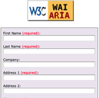

ARIA only works on some of the latest screen readers and browsers. It does not work with all AT (Assistive Technologies). There is no support for speech recognition software such as Dragon NaturallySpeaking. Window-Eyes and ZoomText have limited support.
Derek Featherstone (@feather) has an excellent blog post on A List Apart titled ARIA and Progressive Enhancement where he documents ARIA support on Window Eyes & ZoomText. There are also good ARIA coding techniques and live form examples.
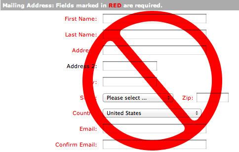

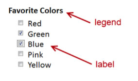
Sometimes developers use color alone to alert users that required fields are not filled. DON'T DO THIS! What you should do to indicate a required field is to place text in the label that says so. Many times you see a red * or the text (required) placed in the label. This is the recommended approach. Other recommendations involve creating a star graphic and placing it in the label with alt="Required". This works as well but it is buggy in OS X Lion where the alt attribute is not announced in a label.
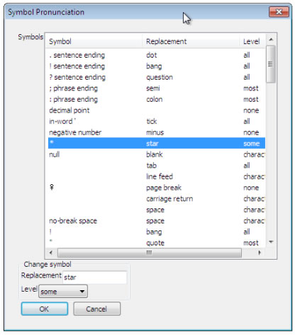 By default NVDA will not speak an asterisk * as "star". VoiceOver & JAWS both say "star". NVDA users can adjust their Symbol Pronunciation settings to force * to be spoken by setting the Level to "some" but not all users are aware of this feature and will usually be running on default settings. By placing the aria-required="true" attribute on all required fields NVDA will now announce they are required at the default settings. VoiceOver and JAWS will speak the star and the required attribute.
The easiest enhancement is to add the aria-required="true" attribute to all required fields in your form.
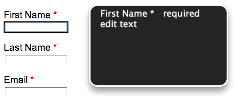
Below is a screenshot of the VoiceOver Caption Panel on OS X Lion which provides an excellent way to visualize ARIA/screen reader output if you're deaf or hard of hearing or don't want to annoy others in the room with your computer speaking everything out loud. I think it would be cool if iOS could do this as well!
Don't worry about having the HTML5 required attribute and the aria-required="true" attribute and causing repetition. All the screen readers I've tested only speak required once. Here aria-required is your fallback for browsers who do not support HTML5 like Internet Explorer. This way screen readers which support ARIA will speak the ARIA attribute when used with IE and ignore the HTML5 attribute.
ARIA2: Identifying required fields with the aria-required property
Use aria-invalid and aria-required To Improve Access to Forms
Marco Zehe (@MarcoInEnglish) from Mozilla wrote a post called Easy ARIA tip #3: aria-invalid and role "alert" which recommends setting aria-invalid="true" on fields with errors and creating a div with a role="alert" to hold the error messages.
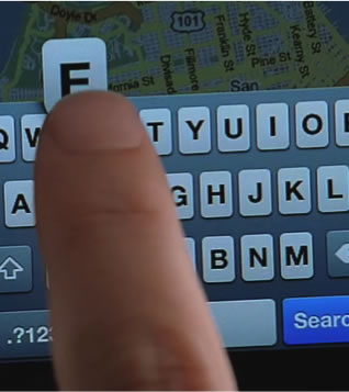
 How do assistive technology users navigate forms? Do they tab through the inputs like I do to quickly fill the fields out with the keyboard? Do they use their arrow keys to go down through the fields and the text between the fields? Or do they use other screen reader shortcuts like the F key for form fields?
In most of my experience testing forms and receiving feedback from others in the industry, tabbing through forms is the most popular interaction method. This is why I recommend placing all instructions and errors in the labels. As the user tabs through they would hear all instructions spoken by a screen reader.
What if the instructions to complete a form field are just really long and you'd rather not include them all in the field's label? Well if the user's AT & Browser have support for ARIA you could instead include those long instructions above or below the field and then point to them with the aria-describedby attribute causing the supported screen reader to speak those instructions after the label.
ARIA1: Using the aria-describedby property to provide a descriptive label for input controls
If you are using explicit labels and aria-describedby then there should not be many reasons to need to use aria-labelledby on form fields. Marco Zehe has a good example of where aria-labelledby could be useful on forms. Easy ARIA tip #2: aria-labelledby and aria-describedby. The example illustrates a problem where a text input field might be placed in the middle of a sentence but it needs to be labelled by the first part of the sentence, the input's value itself, and the final part of the sentence.
aria-label is meant to be used in cases where a text label is not visible on the screen and a visual tooltip is not desired like when using the title attribute.
In the second version of the ARIA demo form I've used the aria-describedby attribute as a replacement for placing input formatting instructions in the label and positioning it below the form field with CSS. Instead of using visually hidden labels with CSS I used the aria-label attribute to label inputs that do not need a visual label like when a phone number is split into three fields.
In these other ARIAs for consideration I've only been talking about their usage on forms, however, they are many times meant to be used to label and describe "desktop-like" HTML widgets that have been built using non-form tags such as divs and list tags. For more information read: Using the aria-labelledby attribute & Using the aria-describedby attribute from the Mozilla Developer Network.
 Old browsers? Old AT? JavaScript to the rescue
Sure JavaScript has some limitations but really there are none when you code it with accessibility in mind. It works on pretty much all browsers and mobile devices. No one really disables JavaScript unless they're a security nerd. If you want to handle a situation where JavaScript is turned off and protect your database from SQL injection attacks then you have to validate form input on the server side as well. Server-side validation can be considered the lowest layer of accessible form validation and will work in any browser including feature phones.
jQuery is the dominant JavaScript framework on the web and can be declared the winner of the JS framework wars of the past years. jQuery's motto is "Write Less, Do More". Minimalism and accessibility go very well together!
It's very simple to add jQuery Validation to any HTML form. Link to jQuery, we're using a content delivery network here so we don't have to download the JavaScript file. Then link to the validation plugin. Then tell jQuery to run the validation plugin on your form with the id attribute you want to validate. This will happen after the document is finished loading. Add this code to the <head>.
The plugin picks up on our inputs with the HTML5 required attribute and by default will instead do its own JavaScript validation and not use HTML5. This is a problem. We want to run HTML5 validation in browsers that support it and only run JavaScript validation in browers that don't support HTML5.
 There are some issues with the default settings. It stops the native HTML5 validation. The other big accessibility issue is that by default the error messages are placed in a second <label>. So there are two labels pointing to one input. This is a problem for some screen readers. VoiceOver will not announce the second label when the user tabs through the form. Steve Faulkner (@stevefaulkner) wrote a recent blog post titled, Notes on applying multiple labels for a control using the label element, and created a test case, multiple labels for a control using the label element, where you can see where multiple labels fail in certain AT. aria-labelledby is a better solution than using multiple labels.
So we have two problems so far with default settings. HTML5 validation is disabled and two labels are pointing to one input. The third problem is that the error message is being placed below the input. So we need to move that into the original label and use CSS to position it where we choose.
Options for the validate() method
There are many options to change the default settings of the validation plugin. We want to change the errorPlacement and errorElement. We also want to remove the novalidate attribute that is applied to our form by default.
Change the code in the <head> to this:
To change the errorPlacement I found some code on Stack Overflow to select the associated label element of an input field and append the error message to that. Then I changed the errorElement to be an <em> rather than another <label>. And then used jQuery to select the form on the page and remove the novalidate attribute.
Now this is the behavior we want. Modern browsers like Chrome and Firefox will first run HTML5 validation and then other browsers with less HTML5 support like Safari on Mac an iOS will use jQuery Validation.
It even works in IE6! Check out the two demo links in different browsers to see the differences.

Demo Form with HTML5, WAI-ARIA, & jQuery Validation (Default Settings)
Demo Form with HTML5, WAI-ARIA, & jQuery Validation (Tweaked Settings)

Let’s change this problem with data entry on the web!
I first developed this talk for CSUN 2012. You can download that original PowerPoint presentation at HTML5 & WAI-ARIA Forms with jQuery Validation.
I also wrote a 3-part blog series on the topic which I then encorporated into this presentation.

This presentation and slideshow template is always evolving, most ALT text should be added and correct. Please contact me if there are any issues.
You can use the left and right arrow keys or page up/down to navigate between slides. If you're using a screen reader you may need to use the pass through key first then hit arrow keys. Page up/down works with screen readers enabled without the need for a pass through key.
JAWS Pass Key Through, INSERT+3
NVDA NVDA+f2: pass Next Key Through
